Data visualization is the presentation of data in a pictorial or graphical format. Though the term may be new, the concept is not. For centuries, people have depended on visual representations, such as charts, graphs, and maps to understand information easily and quickly. As more and more data is collected and analyzed, decision makers at all levels will increasingly look to data visualization software to find relevance among millions of variables, communicate concepts and hypotheses to others, and even predict the future. Today’s organizations need to think of their data as a great but unedited story which needs the help of visual analytics to bring it to life.
In a big data world we need data visualization:
According to Research Scientist Andrew McAfee and Professor Erik Brynjolfsson of MIT, the amount of data that crosses the Internet every second is greater than all the data stored in the Internet just 20 years ago. This amounts to exabytes of data being created on a daily basis. While big data remains, for some, an overhyped term, the reality is that the explosion of data is unlike anything we’ve seen before. Data volumes will continue to grow as more devices come online including computers, smart phones, tablets, new apps and services, along with an increasing number of devices outfitted with smart meters and sensors and GIS transmitters.
In light of this data explosion, data visualization tools are becoming increasingly important for managing and navigating information glut, and are making big data easier to digest. With advancements in technology, data visualizations are taking on more complex forms than ever before. They are being used to unravel the meaning behind big data sets that would otherwise be too difficult to understand.
How data visualization is changing the world of marketing:
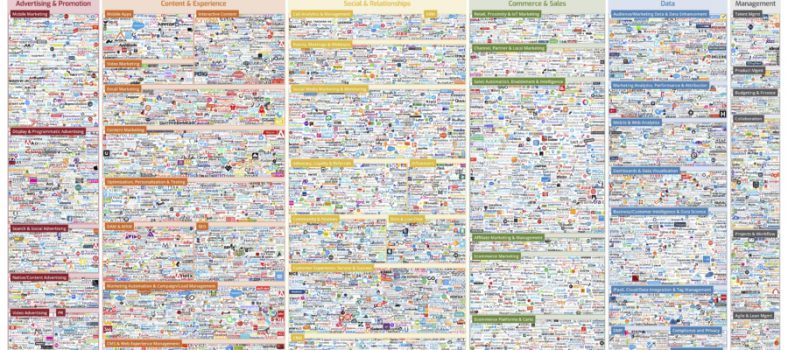
Most marketing organizations are awash with information, whether it’s demographic, socioeconomic, geographic, behavioural, transactional, or one of the other myriad of data segments that make up customer intelligence like social media and smart devices. However, this information is often stored in a variety of different systems, some internally owned by different—often siloed—departments and articulated in various formats but also external in repositories like Datasift and GNIP. What is lacking from this information surplus are the insights needed to make the best marketing decisions. Presenting information visually empowers marketers to very quickly explore all customer data, no matter the size. Visual data adds a level of accessibility that can help marketers rapidly identify key relationships and uncover insights for creating more detailed customer segments (e.g., based on purchase history, sentiment towards brand, life stage, etc.) and more personalized promotions and messages.
Today’s marketers need to be nimble at converting data into insight, and data visualization software is integral to helping them find relevance among the millions of variables that can help target customers with relevant offers. For marketers, that can mean decreasing the time spent on finding key answers such as which messages are best suited for different customers, which time of day or day of the week are more important for certain offers, or figuring impact of activities to better plan marketing resources.
Buyer Beware:
While data visualization is a very glamorous field right now, users must be pragmatic and start with the basics: data analysis, data management and best practices in data visualization. If possible, try before you buy the solution and make sure you are asking questions that are realistic and tied to your business goals. Most importantly, ask yourself, will it help you forecast? A lot of tools enable hindsight but does the tool offer foresight – can it offer you actionable benefits to plan for future success?
In order to generate the best visualization for your data there are a few basic concepts you should follow:
- Understand the data you are trying to visualize, including its size and cardinality (the uniqueness of data values in a column)
- Wherever possible remove noise and any data deemed obviously irrelevant.
- Determine what you are trying to visualize and what kind of information you want to communicate
- Know your audience and understand how they process visual information
- Use a visual that conveys the information in the best and simplest form for your audience


No Comment